
The Layout Control is used to make the display of the data entry screens more flexible. The controls are assigned to the Layout Control and the alignment and size of the elements are automatically adjusted.
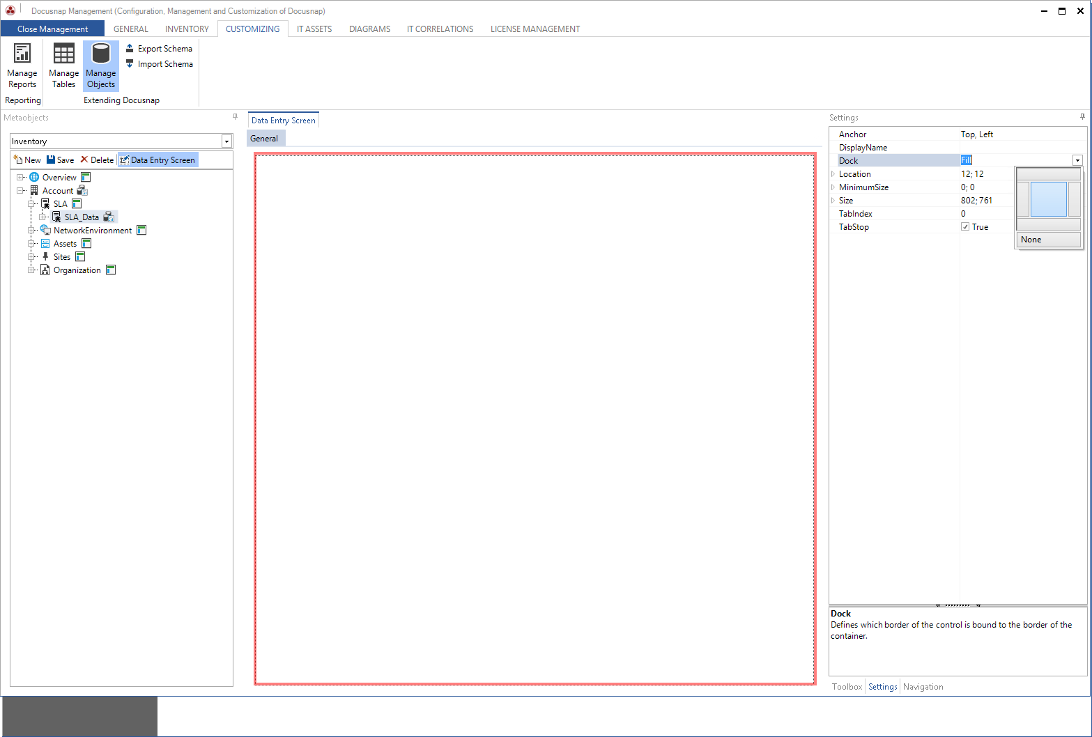
In the first step select the Layout Control in the toolbox and add it via Drag & Drop to the workspace. The property Dock is used to define if the control is bound to one or several borders of the workspace. The setting Fill is best suited for the shaping of the data entry screen.
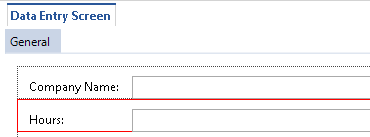
Afterwards, the desired controls are dragged into the workspace.
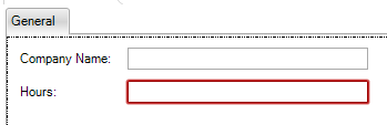
For each control on the layout control the label and the actual element are displayed. For each element specific settings can be made. By clicking on the label the layout settings are displayed in the Properties window.
Specific Properties of Layout |
|
Control Size |
In most cases, the default value of 0,0 is maintained, thereby the size is set automatically by the Layout Control. |
Height / Height Type |
The height of each control can be set in pixels (Absolute) or a percentage (Percent). The HeightType defines whether the value in the Height property represents pixels or a percentage. If the height of all the controls are given in percent, then the height will be divided according to the specified percentage. If the sum of the specified values exceeds 100, a scrollbar is displayed. If the heights of the controls on one tab are defined in absolute values and percent, then the available height will be used for the controls with the absolute values. The remaining height will be divided according to the specified percentage among the controls with the percentage values. For example define the height for the textboxes with an absolute value of 30 px and then define 100 percent for a rich text field to occupy the remaining space. Use percentages so the data entry masks are displayed properly on screens with different resolutions. |
Padding |
This property defines the distance to the borders. By default the padding is 10 px to the top, left and right. |
TextDE / TextEN |
For every control a caption is displayed. Using these two properties, the names of the controls in both German and English are entered, with TextDE represents the German name and TextEN represents the name in English. |
Text Visible |
When adding a control a label is created. If this label should not be displayed, the TextVisible property must be set to false. |
Width / Width Type |
The width of each control can be set in pixels (Absolute) or a percentage (Percent). The WidthType defines whether the value in the Width property represents pixels or a percentage. By default, each control is created with width 50 and width type Percent. Thereby two controls are always displayed side by side. If a control should extend over the entire width, the width must be changed to 100 percent. The percentages can be assigned as desired, but controls can be only be placed next to each other, if the sum of specified percentages does not exceed 100. If the widths of the controls on one line are defined in absolute values and percent, then the available width will be used for the controls with the absolute values. The remaining width will be divided according to the specified percentage among the controls with the percentage values. |
The default values that are set when adding a control to a layout control, can be changed in the layout control. After changing the default values all the controls, which are added to this layout control, are created with the default values. Controls that have already been added are not changed.
To configure the settings of the control, highlight the control itself.
|
When a control is added to the Layout Control, some properties such as size, docking and location are controlled by the Layout Control. Therefore, these properties are disabled for the individual controls. |

